Creating a wine label must check legal requirements and as well as aesthetic preferences
Cling to Freedom - Wanting freedom to create above all else.
It's election season and you know what that means..... muting every commercial break. Jokes aside, it means get informed and get out and vote.
Freedom (as listed in the Merriam-Webster Dictionary): the quality or state of being free: as
a : the absence of necessity, coercion, or constraint in choice or action b : liberation from slavery or restraint or from the power of another : independence c : the quality or state of being exempt or released usually from something onerous<freedom from care> d : ease, facility <spoke the language with freedom> e : the quality of being frank, open, or outspoken <answered with freedom> f : improper familiarity g : boldness of conception or execution h : unrestricted use <gave him the freedom of their home>
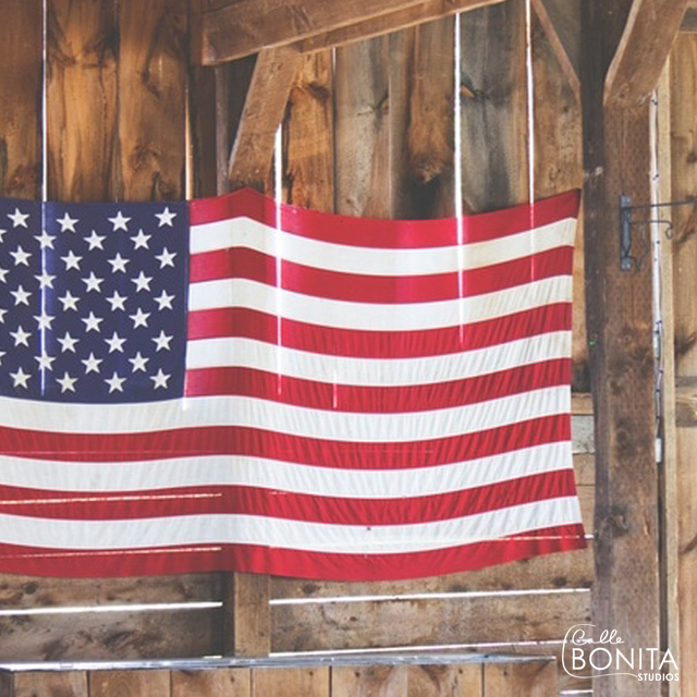
I feel eternally grateful for the freedoms that I have as an American and as an American Artist. Not being able to create the work I feel passionate about and purely enjoy doing would be heartbreaking, and it's happening to people all over the globe. There are much larger world problems than people not having the freedom to create what they want, but what if every person in the world had the freedom of expression? What do you think the world would look and sound like? Building on the great tradition of freedom of expression is a privilege that I am thankful for. Sharing and advocating for others to create is a privilege, and I have hope that one day freedom of expression will be encouraged to every person.
New starts - Best practices to starting a new project
Congrats! You're starting on a new project, yahoo! Now put that energy in to planning and doing.
- Building a road map on how you are going to tackle any new project allows you to prioritize and later on better explain how you got to your final designs with your client.
- Documenting and saving appropriately. Remember, you eventually will be sharing your work with the client, who will eventually be sharing that information with other vendors, media, and customers so name and save your work appropriately.
- Each variation of your work submitted matter. Don't think that just because your first go at a new project was not approved for the final artwork that you wont reference the original version down the road. Do NOT delete or overwrite any submitted project version, you never know when it will be reference later on, and who wants redo their work.
- Enjoy the dialog. Listening and expanding to a current design is all part of the fun, challenge yourself to listen and engage in the dialog. Don't be afraid to ask questions!
- Finish with finesse. Be grateful for the opportunity to have had the chance to work on this new project. You probably learned a little something along the way and the client trusted you with their project.
Have Friday brain? Getting to the core of a project quickly so you can get to the weekend.
Do you ever start a task and then realize you have been thinking of something far down the line which doesn't actually relate to the current task at hand? Overthinking a project is normal, so get over it. Write down all of your thoughts or concerns for the project, that way you don't have to spend time and energy reminding yourself of what the concerns are.
Cutting through all of this mind clutter is how to get to the core of your project. Always ask yourself, what is the goal? Does "x" help me achieve this goal? Even as a designer, it can be overwhelming when you think of all of the possibilities available for you to create. Clear your mind and keep going back to addressing the goal, it will help navigate in the right direction.
Burnt Out - Fall Brings Burnt Tones To The Forefront
Hello Fall!
I've missed you and all of my favorite natural colors. Every Fall the landscape changes and I am reminded why it's my favorite time of year. Visually it is my favorite time of year because the landscape has a burnt orange overlay extracting all of the ripeness of the earth, and each sunset is more incredible than the nights prior. Playing with rich deep tones and also the light and bright tones of the tall grasses and the clear morning sky bring a unique contrast to the season. Look outside and it's very probable you can create a new color chart with the tones you see from your window. Now go play in some leaves or something!
Choosing a Background Color: PLATES
White, grey, black, brown, green, what is the best color for plating food? I'm not a chef, I don't pretend to be a chef. I do know design though. When you think of a well thought out plate of food, you usually want to create something that is both mouthwatering delicious and also visually pleasing (so people will try what is on the plate). I only know this from past experience of spending most of my life ONLY eating things that visually look delicious. Luckily I have grown out of my skepticism of food that isn't orange or covered in icing.
If we think about how we use design and color to compliment the meal, this is when a delicious plate of food goes from delicious to THIS IS SO DELICIOUS, I HAVE TO POST ABOUT THIS NOW. Don't lie, we've have all been there. Choosing a plate to complement the main focus "the food", I think depends on the meal itself. Using a green plate for a yellow curry dish, does not seam like an appetizing plate of food. Using a black or cobalt grey dish for a vibrant yellow curry is a much better compliment to the food itself. Consider choosing a background color (the plate) for your meal next time you a cooking to impress.
Viva La Fiesta! - Life is Vibrant
Living in Santa Barbara County has many benefits. One yearly reminder of just how beautiful living on the Central Coast is, is Fiesta. Color fill the flag lined State street, and muti-colored confetti seams to rain from the balconies above. It is a time to remember Santa Barbara's heritage and also to embrace the people and cultures which settled the Central Coast. Dancing, costumes, food, art and craft are all on display and it's time to party. The vibrant colors that fill the streets are my personal favorite part about Fiesta. The amount of color everywhere just makes me smile, and I'm not alone in this feeling. Showcasing vibrant colors actually makes people genuinely happy. The evidence is right on the street. I think this is why color is my favorite part of fiesta, people are just happier. Viva La Fiesta!
Feeling Moody - Essential Mood Board Training
Great design don't always just pop out of nowhere. Mood boards cultivate ideas, and when trying to develop, nothing helps bridge the gap between the idea person and person who creates like a mood board can.
Mood Board Essentials :
1. Name - give your mood board a name that excites you about the project, and what it can become. If you start with a boring name, the project will be come boring.
2. The Hunt - Finding objects, colors, tones, language, lines, photography, filters, applications that inspire you for the project at hand. Specifically identify the aspects of these items which you would like to bring into your new project. The idea is not copy, but to use items from all aspects relating to the project to inspire you to create something new.
3. Edit - Once you have collected all of the elements which inspire this project, edit them. When you started hunting for inspiration, you may have been going in one direction but realized somewhere along the way there were better paths to take. So delete or separate all of the items that no longer belong in this project.
4. Implement - You may not use every idea that you found will on your inspirational journey. Actually, please don't use every aspect in your mood board all at once. Save some of the goodness that remains in your mood board for a rainy day, you never know when a few extra assets will need to be created.
Rituals - 10 minutes of daily drawing (free drawing)
Art has been used IN rituals for thousands of years. You probably have recognized art and design in your personal rituals. Rituals like going to a religious service, the mural you see on your daily commute, the design on your favorite coffee mug you use every morning. Even rituals like walking the dog, and the trusty Nike swoosh on the shoes you grab overtime to perform this ritual.
How often does art BECOME a ritual though? Incorporating a dose of creating can be incredibly rewarding. There may not be any monetary gains from a daily doodle, but it can be a great stress reliever or just a good daily laugh. A doodle a day, keeps the doctor at bay... I think that is how it goes.
Hitting The Wall - Knowing When To Put The Mouse Down
At some point we all hit a wall. Solution: oxygen. I realize when I have hit a creative wall, when I realize I've gone around a design challenge and made it full circle to where I started. That is when I know, time to get some oxygen. It is incredible the amount of creativity and clarity that can come with taking a 5 minute walk outside, or just sitting outside for 5 minutes. Sometimes being so close to a project can cause you to lose a sense of your surroundings. Take a break, check in with the outside world and refocus for more productive design time.
Putting The Mono In Monochrome
Mono - alone, single.
Monochrome - an art technique using different shades of a single color.
Being a single in a sea of complementary, analogous, and triadic can be lonely. There are benefits to being a single in this same sea though, it allows you to not be anchored to any other shades.
When starting branding and logo development sometimes being tied down to other shades limits your options from the get go. Staying monochrome for the beginning of branding development or even the entirety of brand development is simple but effective. When you start in monochrome you can analyze the nature of the essential design elements before you are swayed towards a certain design purely based on color attributes.


